Tips for Creating Web Pages in the CMS
DO NOT copy directly from Word
or from any other word processing program. These programs have their own styles and code and when you paste the text you paste the associated code which can and will conflict with the htnl code on your website. Instead, use Word to type your content because it has spell check, then copy that into notepad which will strip away and styles. THEN copy into the CMS editor. Then format your text.
USE the headline and paragraph tags.
These tags are preformatted for your site and will help your pages to be consistent with font and color. We use the headline tags on your home page and any other interior pages that we created. If you highlight a paragraph and choose "Normal" this will format the text to be the same font and size that we have used when creating your site.
PRACTICE!
Take advantage of the unpublished page feature. When you create a new page, leave the "Publish this page" unchecked. That way the page is only viewable when you are logged in. You can practice making pages look the way you want and when you are happy with a page you can go into the page settings to check the box and make it viewable by the public.
Columns and Rows in a responsive website
If you have a responsive site you will want to learn about coloumns and rows. While traditional html tables have some responsiveness to them they are not generally mobile friendly and will not flow the way that responsive columns and rows will flow using responsive design CSS and techniques.
VRM has built its websites using the popular Bootstrap framework. The majority of the elements found on the Bootstrap website will work with VRM built websites within the CMS. But to use them you must write your own code either in the html editor of the CMS or another text editor that you prefer and copy the code into the html editor. The WYSIWYG editor does not have responsive layout functionality built into it.
You can learn to use Bootstrap Grid System here.Feel free to explore all of the Bootstrap website for ideas on things that you can do.
Responsive Images
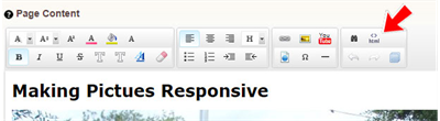
We will soon be switching out the editor for the CMS and it will automatically create resposnive images. However, if you want your images to be responsive at this time you will need to add a tag to the html code. Click on the html icon as shown below.
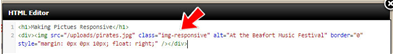
Find the code that deals with your image. It will begin with <img scr and will end with a closing tag. See the image below. All highlighted area is the htm code to place and align your image. ![]() The picture below is the code before editing.
The picture below is the code before editing.
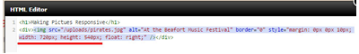
Edit that line by adding before the alt tag class="img-responsive". Make sure you type it exactly. Then you will need to delete the width and height attributes. Make sure you delete the semi-colon after the width and height numbers. The image below is the code after the edits.